Saturday 7 November 2015

Girls, Girls, Girls at Counter Plymouth


I missed this event last year, but actually made it to Counter this year - thank god, because it was incredibly inspiring! I went to the launch party at KARST, a contemporary art space in Plymouth, the night before the book fair with friends (see photos here) - it's safe to say I drank quite a bit, did some embarrassing dancing and requested Beyonce at what seemed to be more of an art performance rather than a 'requests invited' DJ, but they did oblige me with Single Ladies so I could throw some shapes. Win!


So with a slight hangover the following morning and in need of some art inspiration, my friends and I walked to KARST for the Counter book fair - after looking at the range of exhibitors beforehand I was quite excited to see exhibiting some all female art collectives, DIY stallers and also the amazing papers by G.F Smith. It was better than I thought it would be, the work on show had a great range of books, zines, posters and art prints covering a broad variety of different themes, there really was something for everyone.


These are just some of the brilliant stallers that caught my eye on the day:

THE KEIKEN COLLECTIVE
All the girls of the Keiken Collective were so sassy! They each wore a badge which I think had a photo of each of them leaping in the air naked (I so want one!), matching outfits of a red dress and purple tights and petals on their faces - they were angels! And we chatted a lot to Jess Pemberton - the one with the most amazing laugh - seriously I had major girl crush going on there!

I bought a beautiful textured lilac beauty of a zine from Hana Omori and after wandering around the rest of the fair for an hour I kept looking over at her beautiful prints and eventually decided that I couldn't leave without one, when I returned to the stall to buy it I hovered behind everyone else crowding around, impatient to get my hands on it. Eventually I caught Hana’s eye and after a quick gushing conversation about how happy I was to buy her work and a really awkward handshake (I have no idea why I shook her hand after she hugged me - I think I've been an adult too long!) which we were both confused at! I departed with a gorgeous print on Japanese paper by GF Smith, I was so excited about having the print in my hands that I forgot to ask her what it was even about, I was just so drawn to it aesthetically that it never crossed my mind.

The other work on the stall was also amazing, I wish I could have bought all of it, the written work was beautifully curated alongside images and illustrations of nature which mirrored the petals on all the girls faces and they handed out free poetry and words as people explored their work. It’s great to see young all female art collectives out there showing their work - they had a confidence and excitement which was infectious - I left inspired and jealous of their beautiful aesthetic!

Some of the brilliant girls from the Keiken Collective

THE B.L.N.T COLLECTIVE
Another art collective present at Counter was The B.L.N.T (better luck next time) Collective which was a stall covered in glitter, the colour pink, collage and just all round brilliance. We kept going back to this stall and there was a zine I wanted to buy but it was just a display copy so unfortunately it was out of my reach, but I remember the stories in it were brilliant and one involved a guy who was weirded out by his girlfriends relationship with a turtle - funny and intriguing at the same time.

I purchased instead a zine that caught my eye straight away, it was all wrapped up in tissue paper and the only one you couldn't physically look at without buying it - that mystery in itself peaked my curiosity and when the artist herself, Sophie Malpas revealed that it was titled 'Consent' I knew that I had to buy it, part of me intrigued as to what was inside, but the other part of me scared of what might be there - the subject of consent is obviously a massive issue and something that I would say I was personally interested in.

My favourite part of owning this beautiful zine was not even knowing what it looked like when I bought it, symbolic in itself of consent. I had to unwrap it, tearing the tissue paper and breaking the tiny stars holding it together in order to reach what I now owned. A very simple way to talk about a very big issue, I actually felt like I was destroying it in a way by ripping the paper and watching all the sequin butterflies tumble out onto the floor. It was a simple zine, only a few pages with fractured words and images - broken and vague - once again that symbolism coming through. Really beautiful work, I only wish I could have bought more to support their collective.

Consent by Sophie Malpas

LADIES OF THE PRESS
The wig wearing, zine making women of Ladies of the Press were putting together a free zine on the day called Grassroots, mixing live art performance and print media. Ana and RenĂ©e handed us a zine and a tiny plastic spider each whilst telling us all about the zine and how we should see them in London at their next event and chat about zines - in response to my friend and I who are planning on collaborating on a zine together. All the people we were meeting on the day had such an energy, it was all really exciting and great to see something like this in Plymouth, I would love to get involved next year!

Ladies of the Press were making zines for the public throughout the day.

RACHAEL JENKINS
Rachael was stalling with Pea Robinson and both of them had for sale a range of whimsical drawings and prints, I bought one from Rachael called 'Cheekies' which is a lovely little painting of some dark pink knickers with the handwritten word 'cheekies' underneath. I can't wait to find a cute little white frame for this lovely piece. Every time I see it it makes me smile, I just want to call all my underwear 'cheekies' now and I want to paint it all onto bits of paper!

A 'Cheekies' print from Rachael Jenkins.
Excited to see what next year holds and you never know I may have a stall next time with a few zines and some of my illustrations - I'm actually thinking of doing a re-run of some zines I made a couple of years ago so it is possible. See photos of the day by Dom Moore on the Counter facebook page!

Sunday 16 November 2014

Todd Hido: On Landscapes, Interiors and The Nude

The book arrived and I spent the early hours of the morning reading it

I have been waiting for this book for about a month so when it arrived I had to spend that very same evening reading it. Now my first comment is on the cover, despite the same layout being used on all the Aperture Photography Workshop series, it suits Todd Hido's work the best. It reflects the layout of his Excerpts From Silver Meadows exhibition piece:

Excerpts from Silver Meadows by Todd Hido
Hido's work was a massive inspiration to my own project that I showed up in London at the Free Range Show 2014. So its safe to say I am a massive fan and follow his work quite closely, although I am still yet to get my hands on his Silver Meadows book! 

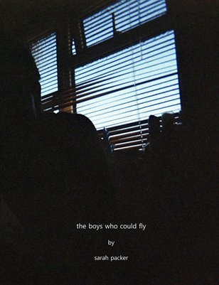
The Boys who Could Fly by Sarah Packer

Gregory Halpern writes the introduction for the book, an ex student of Hido's meant that it was a very personal introduction and the insight he had into how Hido works and inspires others was a fantastic addition to the book. A line that particularly stood out for me was when he mentioned Hido's two books 'Outskirts' and 'House Hunting'. 
"Those books were both short, and I wondered how they felt so complete and powerful with so few images. I wanted to know how he edited and asked him about his process one day. He smiled and said without missing a beat 'All killer; no filler.'"

I had to go through that process when I edited my book for The Boys Who Could Fly project. My first book was big and thorough - it was more of a collection. So I re-examined all my images and researched more into the output of my genre of photography. I ended up producing a zine which had low production costs and when holding it, it just felt right. I had less images but they made more of an impact. Just doing that made me re-evaluate how I wanted to present my work. 

Anyway back to Todd Hido's book, it is refreshing to read a photography book about a well established artist that doesn't sound stuffy and technical. It reads in a very conversational style and for the reader it gives the feeling that you are on the same level as the artist. For a photography graduate like myself, I always thought I could never reach the perfection of the photographers I so admired. But Hido makes you believe that you can do it and explains that under that outward presentation of amazing work is months of taking the same shot over and over and leafing through contact sheets to find the right image. 


I would have preferred a wider variety of his images - many were quite similar - but I loved the inclusion of photographs he took as a child. Sometimes I think we forget that these artists were children once and were new to taking photographs so it added to that personal connection to Hido that the book was building up. 


I think this series of books from Aperture will be very well received, they are not a massive in depth book on the photographers technical know how and skill, they are more like an insight into the emotional and personal connection the photographer has with their work. Its about the spirit of the photographer and why they photograph the things they do. Often you just see the final results of a photographers work so this book has given me a much broader insight into Hido's thought processes and what drives him. Equal parts photographs and text, it doesn't overwhelm the reader and I was able to finish reading it in an hour or so. 
The yellow inside and on the spine seems to be a popular colour in recent photobooks as it is exactly the same shade of yellow used in William Egglestons' book 'For Now' and similar to Stephen Shores' 'American Surfaces'. They all match up nicely on my bookshelf!

There is this weird note at the bottom of the book on the back cover which says:

I just think that it isn't appropriate, this book doesn't feel like a 'how to' book at all. It is about the photographer and their connection to their work, its about their thought process rather than their work method. I just found it to be an unnecessary addition to the book, but other than that it was a worthwhile purchase and a book I encourage you to add to your bookshelf.

http://aperture.org/shop/todd-hido-on-landscapes-interiors-and-some-nudes-books


Tuesday 14 October 2014

Peachy N Keen at Unveil'd

Unveil'd was a three day photography event hosted in Bristol's Edwardian Cloakrooms, featuring exhibitions, talks and a photobook/zine fair. I went particularly to see Peachy N Keen, the female duo who promote female artists through a blog and website. They now host exhibitions too and I believe this was their 3rd one so far (the others being in London and Brighton). Alongside their show was fellow photography collective 'Young Shot' and Halftone zines. Young Shot exhibited in the Gents Cloakroom and Peachy N Keen in the Ladies. 


The lovely Eleni Mettyear and Rhiannon Adams


I attended the introductory talk by Peachy N Keen, where founders Eleni Mettyear and Rhiannon Adams discussed how they came about and what the future is for their collective. For those who don't know Peachy N Keen, the collective supports and promotes the work of female artists (established and emerging) and hosts interviews and features on their various online platforms. They are looking to make a magazine in the future, which I think is a great way of having a physical interpretation of their work, although it will start out as an online publication. Not only will a magazine widen their audience, it should provide exclusive content and design that sometimes isn't achievable within the constraints of a blog or website.
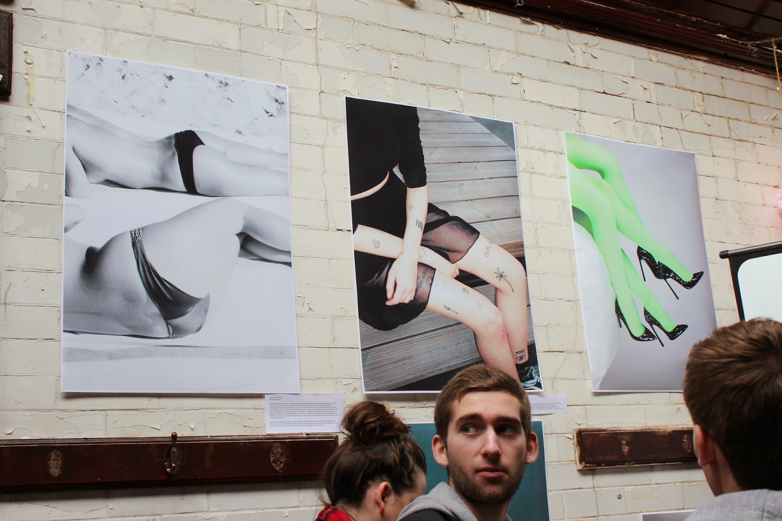
It was a great show, as soon as I walked in I saw the pink glittery tinsel hanging from the entrance, paper pom poms and bold colours - I knew I was in the right place! I was then welcomed in my two girls in front of a projection screen who I instantly knew were Peachy n Keen, despite it being a little cramped (we are in a cloakroom/toilet after all!) I felt very comfortable and welcome. The images were fantastic, I have to say they made an amazing selection and curated it very well. Featuring mostly nudes, it was a brilliant display of the female form and the mix of images provided cheeky, sensual, playful and reflective interpretations. Not constrained by frames or mounting, the images worked well with the pale brick walls and old sink present in the room. The layout was similar to a gallery wall (lots of images on top of and next to each other) where there is no linear pattern, but rather a juxtaposition of images that played with each other and triggered various emotive responses. 


Not just colour photography, this black and white image of women on the beach was one of my faves


Sensual and symbolic, the red satin and ghostly pale legs - a combination of those elements usually equals some sexual connotation, but not here - this is pure female expression without the male gaze


A selection of serene nude portraits and colourful legs compliment each other on the main wall

Cheeky - in all means of the word! Loved the triptych of brightly coloured behinds on the window.

Colourful portraits


The woman in water above the sink - very appropriate, was it planned or just coincidental. Either way its brilliant!

What a fantastic show, for them to make what essentially was an old toilet into an art space that is inviting and vibrant is a great achievement that they should both be proud of. I look forward to seeing them spread their wings further in the future and hopefully I'll make it to another show. 


I leave you with a couple of other images I took at Unveil'd.


Curated by Halftone

All the zines hung up in the old toilet cubicles

It was a little dark and cramped in there but when there are zines to be looked at I don't pay much attention to the location!


Photographs by Sarah Packer

All rights reserved © 2014 Sarah Packer. Do not use without the artist’s permission.


Saturday 2 August 2014

Book Review: Brian Merriam

One day I was scrolling through Tumblr - as I usually do when procrastinating - when I stumbled across a post about Brian Merriam, a photographer who was advertising his latest book - In The Mist. As I am an avid photobook collector I couldn't resist having a peek, I also thought that it might come with a nice price too (I was very much correct) which is always a bonus for a cash strapped, book obsessed graduate like myself. What I found was a site full of beautiful photographs that seemed to be a visual diary of this photographers life. It had that dreamy, misty nomadic style of work that I always love, alongside its location in the U S of A - my favourite place! That Americana feel and road trip style nostalgia never fails to get me drawn in. So sufficiently drawn in by his series; ‘it might look weird in the morning’, ‘my fathers summer’ and ‘where the desert goes to die’ I decided to check out the book on the for sale page, to my surprise it was a wonderful little pack of work containing a 48 page full colour perfect bound book "in the mist"+ 28 page full colour zine "the last best place" + limited 4x6 print all for only $25! I clicked the pay button straight away and made my purchase in excitement. Brian then emailed me to let me know the book would be on its way when he got back from his trip - its always nice to know you are dealing with the artist directly, I always feel like the work has then had a personal touch and is unique.


So after a couple of weeks the books arrived and my eyes hungrily leafed through the pages of the book and zine. In The Mist is exactly what it says on the tin. The beautiful, quiet, ethereal photographs flow together to create this mysterious land of fog and cloud, where anonymous swimmers glide through the water and ghost like people wander on rough ground and across bridges. Double spread images fill your vision as you squint your eyes in the hope that doing so would help you see further into the images and perhaps into the minds of those figures in the landscape.


I moved onto the zine next, entitled ‘the last best place’, it contains a mix of landscape photographs, animals, houses and a black truck graffitied with the words ‘say no to meth’ - is this photograph a juxtaposition to the ones of snow covered trees and moody sunsets?
Silhouettes of people creep into the photographs and take their place in some of the landscapes, the human presence in such rugged landscapes is a powerful one and lends the viewer a means as to connect with the images. The varying page layouts allow the eye to wander casually through the work, applying their own interpretations and links with the imagery. The colours are a strong feature here, with yellows and blues taking residence and providing a flow through the work which made them stand out from other similar landscapes I have seen. Brian Merriam has a strong understanding and connection with colour and nature in his photographs and I will be keeping up to date on his work and hopefully he will come out with more books to add to my collection.


You can buy his book and zine here: http://theghostofbrianmerriam.com/index.php/for-sale/ 
I highly recommend you do - you won’t be disappointed.


Tuesday 1 July 2014

Buy my book on Magcloud


The Boys Who Could Fly

By Sarah Packer

24 pages, published 7/1/2014

The Boys Who Could Fly is a collaborative project between myself and my two younger brothers, Mark (18yrs old) and Jack (15yrs old). They are both the subject of my photography but also participants in the process; in taking their own photographs they help in providing an alternative perspective to myself as the photographer, whilst also giving a basis for the truth visible in my own imagery.My work documents everyday situations: visions that…

Saturday 24 May 2014

Book Review - Jim Goldberg: Raised by Wolves

I first saw this book on Goldberg’s website as a video that provides a much more visually interesting online version of the book compared to that of a standard downloadable PDF, that many artists offer. I have now loaned the book out from the library and it is larger than I thought it would be, slightly bigger than A4. It has a fantastic handwritten list of the ‘Cast of Characters’ that play roles in Goldbergs’ compilation of images and text. It then opens out to the first image in the book (as seen on the right) a heavy vignette frames it to look almost like binoculars. A very moody opening that also holds elements of nostalgia and creates a definite time period as a prelude to the work that follows.

 The book then leads straight into a chilling story about child abuse from a friend of Jims and film stills from home movies. You then flick through the images that you think might be related to the story but there is no certainty of this. Then the next story with Echo, the daughter of the woman in the first story. These stories and images give you a basis to put your emotions on, he makes you react and feel for these characters by giving them a back story.


His way of placing images on unconventional backgrounds, makes the images pop off the page, it highlights them and plays with the photograph. The use of colour to play off the black and white imagery. His Polaroid of Echo on a black page is something I will explore in the production of my own book. Playing with coloured pages to bring a playfulness to the work that can sometimes lack when using a traditional white background. His use of handwritten text with his photographs, not only adds to the story but also to the authenticity of the work. Something I seek to do within my own book is to represent my brothers truth and also my own.

The page to the left is an example of how black and white and colour photographs can work together and bring out each other’s strengths when next to each other. This will be an important component within my own book, as I have a mix of colour and B&W imagery within the series. It is actually one of the only stand alone colour images in the book, this anonymous character with his eyes blacked out. I have found that I was more immersed in the text within the book rather than the images, the conversations Goldberg has with these runaway children are filled with sadness and frustration that he cannot help them. The characters he tells us about: Echo, Tweeky Dave and a few others, are the subjects in his photographs and they make the writing feel more real. So in this short amount of time reading this book I felt towards the end this heart wrenching sadness for these people and their lives. I think that was the point, that was what Goldberg wanted to do. I think he cared a lot about these kids and I think this book is a great tribute to them. One of the few photobooks to have made such an impact on me. 

Book Review - Dash Snow: I Love You, Stupid

I have been looking at the late Dash Snow’s book titled ‘I Love You, Stupid’ (440 pp., 430 color illustrations, 11x7¼") as it is filled to the brim with Polaroid’s he took of himself and the world around him, his world really. The photographs are full of drugs, sex, streets, drinking, friends, food, tattoos and various other things that caused me to raise my eyebrow a couple of times. This guy led a wild life and was known by many as being a free artist, one that never stepped into the commerciality of the art world and was an artist for himself, not anyone else. The book is thick and dotted between pages of Polaroid’s are full bleed images of black and white scenes blown up until almost out of focus to break up the monotony of the Polaroid’s four-on-a-page layout.  


In reading the book I found several brilliant quotes that not only spoke of photography but of Dash Snow and his way of working.
The book cites Ezra Pound:
“What is the greatest hearsay?
The greatest hearsay is the tradition of gods.
Of what use is this tradition?
It tells us to be ready to look.”

I love that ‘be ready to look’, in this age we are always looking, we live in a visually saturated society that’s major form of communication is through looking and creating things to be looked at. Then it moved onto citing the great Antonin Artaud:                                                                             
“Masterpieces of the past are good for the past: they are not good for us. We have the right to say what has been said and even what has not been said in a way that belongs to us, a way that is immediate and direct, corresponding to present modes of feeling, and understandable to everyone.”

Our styles, fashions, fads are always reinterpretations of the past, ideas reworked for a modern audience, one that requires everything instantly and where everything belongs to everyone because social media allows for it to be shared to everyone.

Blair Hansen said of Dash Snow: “…one of Snow’s greatest achievements as an artist was his ability to harness the power of immediacy in order to make out experience of his artwork so vivid that we confuse our relative distance from that artwork; it is like touching a life.”

Book Review - William Eggleston: For Now


Right now I am looking at the book in a purely visual way. The cover is particularly striking with no text it allows for the image alone to speak of the intimacy contained within with a photograph of his wife in bed. The yellow border matches the yellow colour theme in the image resulting in a beautifully flowing cover that emanates the vibrancy of the American culture and is a precursor to the style of work Eggleston produces in the book. The book is about A3 size square which really captures the details in the photographs.

“the flow of images, the torrential nature of his picture-making process, registers as a sprawling but precise visual diary, a record of things firmly seen or glimpsed and grabbed at, an inventory of experience.”

“the spaces between spaces, the mundane, the makeshift, all the fragmentary raw proofs of civilisation as a perishable human construction that, nevertheless, provides subject matter for vivid and vibrant photographs.”


“Eggleston claims that he takes only one picture of one thing”

I like that this process allows for a vast abundance of images that all portray something different, not one is of the same scene. It adds to the spontaneous, fast nature of the images and the pure visual diary of Eggleston’s life. They reflect the human enterprise, the human condition is present in each photograph, he is present in each image, not physically but in an almost ethereal way. The portraits are what draw my attention most, they are raw and connective. The subjects often look directly at the camera and hold a strong emotion. The image above of the woman with her hand on her hip seems to say ‘what the hell are you doing taking a photo of me’ or as if the photographer is in some kind of trouble, a disapproving mother asking her teenage kid ‘what time do you call this then?!’. When you first open the book you are confronted by a photograph of a woman crying, all emotion laid bare in the way she looks at the camera, the dishevelled hair, the tired eyes, the tear stained cheek and the look of a woman just having to get on with it. The truth of the human condition.
The title page of the book continues the yellow colour that was present on the cover and thankfully all the text and essays are left at the end of the book which allows for you to delve straight into the photographs uninhibited by another’s view of what you are seeing.
The last few pages contain various essays by people who know Eggleston and his work on a more personal level alongside an interview with Eggleston himself . In this he speaks about the people in some of the photographs and enjoys the fact that all the photographs in the book are ones that have previously been unpublished. His archive contains over 35,000 images so I imagine there are many he can’t recall offhand. The book contains images personally picked out by the author and contain more portraits then previous Eggleston books and the personal connection to the subjects in the photographs to Eggleston make this book more like a family album than anything else. For me, Eggleston’s work speaks to me in its way of capturing moments that are as close to the truth as photography gets nowadays and his use of colour is beautifully, the way he spreads it out in his images rather than clumping it within one corner of the photograph.

Saturday 15 March 2014

Shortlisted for the Magnum Showcase/IdeasTap award

Just found out I was shortlisted for the Ideas Tap Magnum Showcase: Family Portrait, unfortunately I did not win, but being shortlisted was great anyway and it is publicity for my current work.

I received the following email:
“Thank you for applying for Magnum Showcase in association with IdeasTap: Family Portrait. We really appreciate the time you put into your application.
The judges have now selected the winners and they've been published on the brief page. We wanted to let you know that the judges were particularly impressed with your work and felt it displayed real talent - so congratulations on making the shortlist.”


Applying for awards and submitting work to be featured is all part of the process when preparing to exhibit your work using various outlets. 

The work I submitted was some images of my current study from The Boys Who Could Fly series. The link to my IdeasTap portfolio is here: http://www.ideastap.com/People/sarahpacker 


My work on Stampsy

I recieved the following email a week or so after being featured on Girls On Film:


To Me
Today at 2:13 PM
Hi Sarah,

My name is Anton and I am the editor-in-chief of stampsy.com -- a growing  
community of photographers that brings together the very best in  
contemporary visual arts.

I admire your work, having spotted some photographs in Girls on Film mag  
earlier on. It fits perfectly with our vision and values. I would love to  
see you being a contributor in our community.


Please let me know what you think.

Best wishes,
Anton


I looked at the site Stampsy and the work is very in keeping with my style on there and you can only have content on there if you are invited, so I am very flattered to have my work appreciated and then requested for the site. This is the link to my work http://stampsy.com/user/12180/latest/6439 good to see that it has 55 likes already and is on the home page of the site where all the posts that are trending are displayed. 


Girls On Film Photography Zine


I recently submitted some of my images to an online photography zine called Girls on Film and they emailed me today (15th Feb) to ask me to send them a paragraph about the work and a few more images so that they can do a feature on my work. I just sent that off so will be seeing that up soon I imagine. I only sent them some portraits so it is a nice taster size of my work in the lead up to the exhibition and book, I like the idea of gradually feeding out your work to sites so that when you then have the show some people are already familiar with your work. It also makes for good publicity if nothing else!

The zine has featured on DazedDigital, Urban Outfitters, Vogue Girl, Elle Girl, Nasty Gal, It’s Nice That, Wow Magazine, The Thousands, Lost at E Minor, No Thoughts, Boys in Trouble, Farm Rio, First Look, Nostalgic, The International Picture House, Article Magazine and more. So I am hoping to get a good audience for my work and maybe the work will be printed in their zines as well. http://www.girlsonfilmzine.co.uk/jack-and-mark-by-sarah-packer/
This is a screen shot of the feature, and also a screen shot of the website homepage where my work is ‘advertised’. The feature has 8 photographs which is a good amount to start showing online, and with the feature being advertised on GirlsOnFilm twitter and their facebook I should garner a large audience for my work. 


Brief Exhibition Reviews: London

EXHIBITION REVIEWS (brief summary)


Somerset House: Behind The Mask - this exhibition consisted of a collection of BAFTA nominated and winning actors and actresses. Photographs were all the same size and framed the same, they were all taken by Andy Gotts and were variants of colour and black and white as some were from his archive of photographs. There were various quotes from certain films on the walls over the mantelpiece in each room. There were about 10 rooms with 5 or more images in each, this broke up the mass of photographs on display and allowed for the viewer to contemplate each image rather than have their view bombarded by over one hundred photographs at once. I was a fan of the more relaxed, playful photographs that reflected the title: Behind The Mask, however there were many of them that were very posed and airbrushed, very commercial and I could imagine them in a glossy magazine. I didn't linger on these ones very often as I’d seen celebrities photographed like this before. Overall, a very flowing layout with the small rooms lending an intimacy to the work.


The National Portrait Gallery: The Taylor Wessing Portrait Prize - I felt that the small space it was displayed in made some of the photographs trapped in corners that restricted the audience’s view of it. I felt that much of the time there wasn't much space to step back and look at the image as a whole. It was also a very clunky layout with images that didn't flow together being put next to each other and the winners were placed out of a linear order of winners which made it a little confusing. The contrasting image sizes in such a small space was also a little disorientating and seemed to place importance on some imagery compared to others. There were also photographs displayed close to the floor which seemed unusual and were difficult to look at properly.  Overall, a good selection of photographs I was just disappointed by the layout of such a prestigious prize. Was also good to see that the ‘Taylor Wessing style’ of dead pan portraits and muted colours has been less prominent in this year’s show. 


The Photographers Gallery: Taking Shots - William S Burroughs, David Lynch and Andy Warhol


“catching the intersection points between your inner reality and what you are seeing”

“arranged to be provocative rather than descriptive”
-William S Burroughs


Burroughs collaged photographs, text and found imagery which he then photographed. You would never see it in its final physical form, only the documentation of it.
The strong use of text in Burroughs work gave me the idea of incorporating text into my own work, the dialogue of my brothers and diary-like extracts. I think this would strengthen the depth of the work and add that realism that can sometimes disappear when put on a gallery wall.

Various series of his were displayed including ‘What was, What Isn’t’, described as being ‘concerned with the relation between experience, absence and presence, and how the camera could evoke something that no longer exists, but also how photographs work to influence and construct memories and desire.’
There was also his ‘Flower Series’ these photographs suggest how Burroughs was experimenting with arrangement of objects to evoke intimate aspects of his personal and family experience. I’d like to do something similar with objects that my brothers own - perhaps using medium format. Anna Dannemann from The Photographers Gallery also suggested this in my portfolio review.  


V&A: Photographic Fictions, Making It Up

A smaller show than I expected with one photograph from each artist on display. The curation was fantastic, the deep blue walls allowed for the images to really stand out alongside the different framing and mounting for the work. The various sizing of the works allowed for visual interest to be maintained which worked in the small space they were contained in. Gregory Crewdson’s image was particularly eye catching, as always with his works they are very strong in narrative and I am very aware that each element within the image contributes to the mood and suggestiveness of the scene. The image below was the one in the exhibition, it was beautifully framed and the large print size (roughly 2 metres wide) allowed for the small details to be visible and for me it felt like the woman in the garage was perhaps covering up a murder. Strange how much you can read into an image that has no story in text with it.
Gregory Crewdson, Untitled (Temple Street), 'Beneath the Roses', 2006

I was also looking forward to seeing Duane Michals’ work, as a long time admirer of his photographs I was slightly disappointed to only see one small series of his. It was 'Chance Meeting', 1972 where two men pass in an alleyway without incident, but the encounter seems loaded with significance. The photographs are framed consistently, and the figures move in and out of the shot, as in a film. It’s one of his less visually interesting works but is one of his most well known, I would have liked to have seen his sequence ‘Christ in New York’, but seeing his work up close was still a great experience. Oliver Boberg was interesting, he photographs real life areas and then models them in his studio and photographs the model. (image below)